Colors are something that designers work with every day, and the importance of colors in a graphic design cannot be overstressed. The colors chosen for a design can have cultural significance and can affect the mood of the viewers, so it is imperative that the colors chosen fit within a brand’s messaging.
Studies have shown that while a black and white image can hold someone’s attention for less than two-thirds of a second, an image with color can hold attention for more than two seconds.
Similar to music and art, color can create powerful emotions and people, and are intrinsically important to daily life – helping us to understand our environment. From the red color of stop signs to the vivid hues of poisonous animals, color plays an important role in the way we perceive our surroundings, and as such, our subconscious minds can be greatly influenced by the colors around us. Studies have shown that most people make a subconscious judgment about a brand or product within the first 90 seconds and that 90% of this judgment is based solely on color. This ties into the fact that 92,6% of people who make purchases say that the visual appearance of the product is the number one deciding factor in which product they buy.
Designers must be well aware of the science of colors in design as well as the science behind colors in marketing to create meaningful designs.
General Color Guidelines for Designers
Before understanding the science of colors in the design, there are some basics of color theory that every designer should know:
- Color should be used sparingly, and only for specific purposes: Overuse of color can detract from its original benefit
- Avoid overusing saturated colors: Saturated colors suffer the worst from the neutralizing effect of overuse
- In search tasks, color can be a distraction: Though color can highlight a target element, it can also prove a distraction, or worse, significantly increase a user’s cognitive workload if used incorrectly
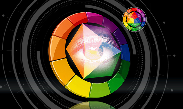
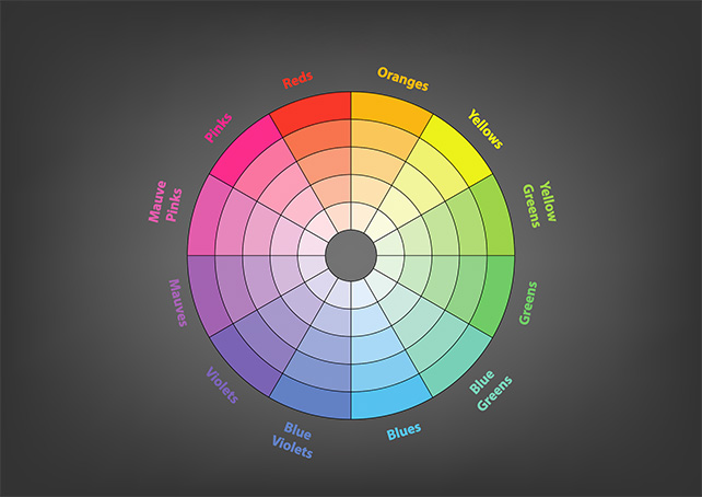
Color Wheel
One of the most important tools in learning the science of colors in design is the color wheel, which helps users to understand how colors relate to each other and how they can be combined, built of primary colors, those colors that cannot be made by mixing any other colors, secondary colors which are made by mixing primary colors, and tertiary colors which have two-word names like red-violet.
Color Systems
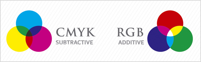
Artists and scientists make use of completely different color systems. While a scientist might mix a red light and a green light to create a yellow light, artists might mix yellow paint and blue paint to create green paint. The different color systems are additive, subtractive and the CMYK system, which stands for Cyan, Magenta, Yellow, and Black.
The additive color system is what is used on screens, considering red, green and blue as the primary colors, and combining these make the secondary colors of yellow, magenta and cyan.
The subtractive model attains color by subtracting light, made up of two color systems – red, yellow, blue, and CMYK.
Analogs and Complementary Colors
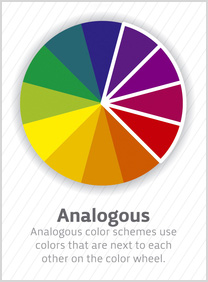
Analogs
Mimicking the color schemes found in nature, analogous color schemes are usually made up of three colors which are side by side on the color wheel. They are most common in plants, such as the leaves of trees in fall, and when used in the design, can make people feel relaxed and calm.
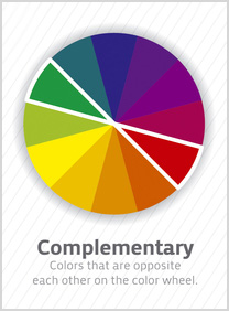
Complementary Colors
Complementary colors are opposite one another on the color wheel; one cool tone and one warm tone, which creates simultaneous contrast. These colors, when used in conjunction, can give a jolt – such as the combination of orange and blue, or green an red. This type of color scheme can be effective when used in small doses but should be avoided.
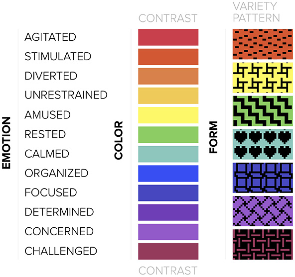
Emotions Evoked by Color Variation
Many designers have asked themselves, “what is the meaning of colors in science” because each color elicits a certain emotional response.
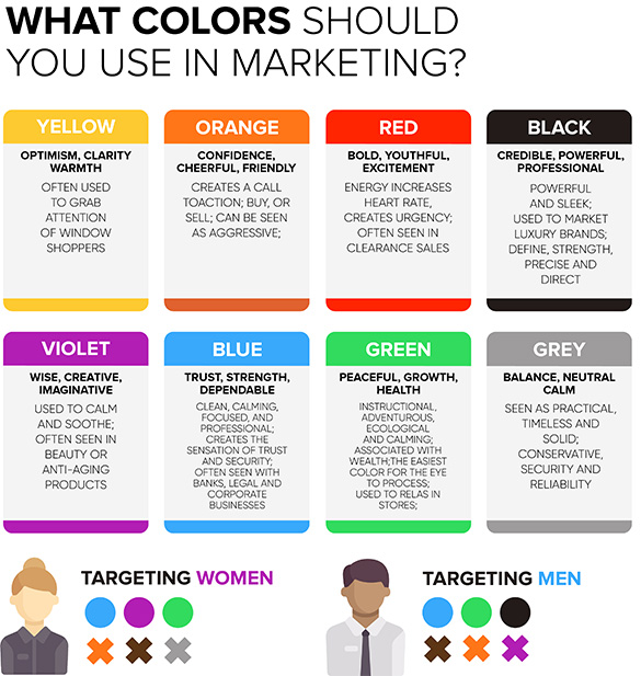
- Red: The color of importance, passion, and aggression. Increase metabolism, breathing rate, and circulation. The color of both love and war. Has a knack for attracting attention
- Orange: Symbolizing playfulness, energy, and affordability. Creates excitement and a sense of haste and impulse. Can signify vibrancy and vitality
- Yellow: The color of happiness, friendliness, and warning. Though most associated with happiness, yellow also triggers the part of the brain responsible for anxiety and can stimulate and revitalize.
- Green: Signifying stability, nature, and prosperousness. Green is the bridge between cool and warm colors and is the most balanced. Represents money in the west.
- Blue: An inviting color is signifying trustworthiness and serenity. The most popular color for web design. Inspires a feeling of security.
- Purple: The color of luxury, romance, and mystery. Association with royalty, purple gives a luxurious and decadent feel. The opposite of orange in that it creates an air of expense
- Brown: Giving a rustic, sturdy and earthy feel. Not popular in web design, brown colors can add an outdoorsy feel, giving an old-fashioned atmosphere
- Black: An edgy, sophisticated and powerful color: the most powerful of the colors, black works as a primary color to add sophistication and elegance
- White: The color of virtuousness and health. The opposite of black, white pairs with anything, giving off an air of cleanliness and innocence.
Color Pointers Every Designer Must Follow
Vibrancy
The vibrancy of an image, or how bright and saturated the colors are, determine the emotion of your design. While bright, vibrant colors can make users feel more productive, darker colors allow their minds to focus, relaxing them.
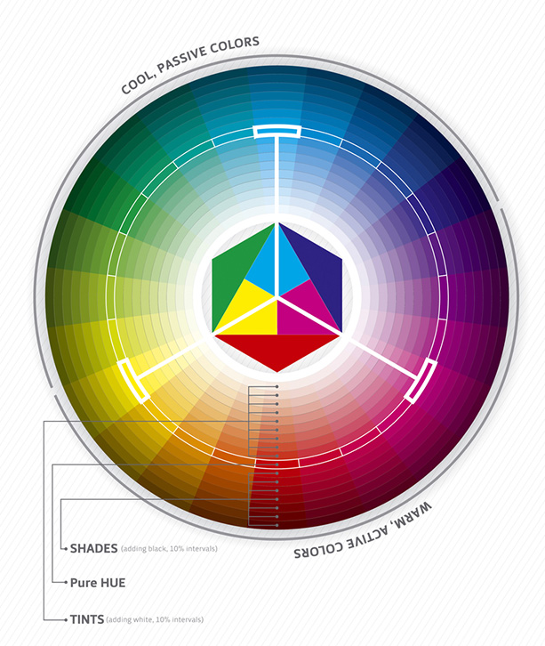
Tints
A tint, in color theory, is a mixture of color and white, lightening the color without making it brighter.
Shades
The opposite of a tint, a shade is a color plus black, offering a deeper and richer feeling, making spaces feel cozy.
Tones
A tone is created by adding both black and white to color – or adding grey. Toned colors are generally more pleasing to the eye

Contrast
Because accessibility is key to design, color contrast is important for designers to remember – the difference in color between two elements, such as the text and background on an image.
Why a Professional Designer Is a Must for Every Business
Good design is vital to the success of a business, and hiring professional designers who understand the basic principles, and the science of colors in design will help to ensure that your brand is remembered favorably.
- Good design sells: In a 2015 study of 63 FTSE trading companies, those who emphasized design did better than those who didn’t, and outperformed by 200%
- The strong design builds trust: Recent studies have shown that “poor interface design was particularly associated with rapid rejection and mistrust of a website.”
- The design of the packaging can alter the perception of a product: As mentioned earlier, 92,6% of people who make purchases say the visual appearance of the product is the number one deciding factor in which product they buy. The way a product looks and the colors used can change how the public views that product
- Good design makes brands memorable: Color can improve memory performance, and The Malaysian Journal of Medical Science has released finding that “…Color has the potential to increase chances of environmental stimuli to be encoded, stored, and retrieved successfully.”
- Good design means good user-friendliness: User experience is vital for brand memorability and success, and a good design can make complex sites easier for users to understand.
Colors Are the Science and Art of Design
Though some people may ask themselves, “why is color important in design?” – the answer is simple. Color creates emotions in human beings and helps them to understand their surroundings. The science of colors in design is important, especially for designers and artists and those who hope to gain the attention of their audiences. Color is a major deciding factor in whether someone purchases a product or clicks on a call-to-action. It is important to work with designers who understand the importance of color and how it can affect your brand’s messaging.
Artwork Abode has more than ten years of experience working with clients from across the globe – from the United States and the UK to Europe, Australia, Canada, and New Zealand – helping them to achieve their goals through design. Offering a comprehensive range of design services, Artwork Abode caters to all design and illustration, from print designs for brochures, flyers and business cards to logo and branding development, storyboarding, magazine layout, book cover designing, and desktop publishing.
– Artwork Abode
Artwork Abode