Though many people think of design as a job based purely in artistry, there is far more to proficient design than just inspiration and beauty. Designers must have certain skills and knowledge pertaining to design psychology if they hope to do their job well, including some knowledge of psychology. “The Design of Everyday Things,” an interesting book by author Donald A. Norman, defines design as a form of communication, meaning the designer should have quite a deep understanding of who they are communicating with. They need to comprehend psychology in design principles, helping to understand users, their motivation, aspirations, and behavior.
If the psychology of color and design is understood and woven into the creative process, it becomes much easier for designers to evoke the required emotions to make their audience perform the actions required of them – such as making contact or a purchase.
Why Psychology Is Important to Design
Competition to stand out in the online landscape is fiercer than ever, and engaging your audience is becoming more challenging. Megabrands with bottomless pockets can experiment unendingly with the last design technologies to make their brands stand out, but for smaller businesses, it is easier and more cost effective to just apply some basic psychological principles.
Psychology-based design means taking into account the psychological drives of your target audience – understanding how they assimilate information and offering them a beneficial experience which appeals to their conscious and unconscious inclinations, rendering them more receptive and more likely to perform whatever actions you require.
Building Trust
On some level, your target audience has to trust you for them to do what you want them to. Unfortunately, this trust doesn’t come easily nowadays – especially given the constant barrage of digital scams and identity theft happening online.
Offering recognizable and familiar patterns can instantly put your audience at ease – or do the exact opposite. You should make the purpose of your site or design immediately clear, whether that purpose is providing information or selling a service or product. Your users should be able to easily find what they are looking for and should be able to quickly and easily navigate between sections and pages of interest.
Subverting user expectations in an attempt to stand out can be hugely counterproductive.
Understanding Psychological Triggers
Understanding basic emotional and psychological triggers can help you influence your audience to perform certain actions. Some of these basic triggers can include things like creating a sense of belonging, appealing to common virtues, or more obvious things such as fear and guilt.
A well-worded copy can be brimful of emotional triggers, and other design features such as colors, fonts, and images can reinforce the desired communication, dramatically increasing user interaction and engagement. Colors can also have a significant impact on how audiences engage with content, with reds invoking both anger and love, and white signifying innocence and purity.
As most people commonly read websites in a Z pattern, basic design psychology suggests keeping the important content within this pattern – with logos in the top left, for instance. Each web page should also only have one focal point so that users are instantly clear on what its purpose it and what is required of them. Using negative space to bring attention to the focal point of the page can also be useful in encouraging the desired action.
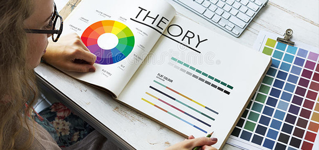
Understanding the Psychology of Color and Design
Because color is intrinsically linked to memories, associations, and emotions, the color used in your designs can have more of an impact on your brand that you might realize. Differing hues can trigger different reactions and can either make a connection with your potential customer or break it. Many people make instant, unconscious judgments about products or brands, often within less than 90 seconds of viewing it, and the majority of this opinion is usually based on color alone.
Working with design psychology, you would specify the emotion you would like your brand or design to evoke, and from there, choose the colors to be used in your design, as well as which to stay away from.
How to Keep Your Designs Effective and Simple
Avoid Clutter
Though designers tend to think that every aspect of their design is important, the direct result of having too many elements on a page is that the end user will not know what to focus on – they won’t see what you want them to and they will eventually get frustrated and leave.
Each page or design should have one focal point, and anything unnecessary to that point is just visual clutter. Limit design elements to only what serves to illustrate the main focal point of a page.
Adapt Shapes and Sizes to Psychological Appeal
Most people form connections to some basic shapes, including universal associations, such as the red octagon that universally known as STOP. Tapping into these associations of shapes and color can trigger emotional connections in your audience and either help or hinder your brand. Some of these commonly utilized shapes include:
Circles, Ovals, and Ellipses
Rounded shapes create positive emotions, are often perceived as feminine and suggest infinity, community, unity, and relationships.
Squares and Triangles
Logos with straight edges often suggest strength, efficiency, professionalism, and stability, while triangles relate to power – associated with law, science, and relationship. Both shapes are associated with masculinity.
Vertical Lines
Vertical lines are most often associated with aggression, strength, and masculinity.
Horizontal Lines
Horizontal lines are often associated with equality, calmness, community, and tranquility.
Focus on the Aesthetics
There are four categories in aesthetics that can affect your designs:
Vision
Our most dominant sense, visual aesthetics are most important, and beautiful designs are magnets for the eyes. Visual aesthetics include the following elements: visual weight, balance, proximity, scale, movement, shape, pattern, color, line, and texture
Hearing
The importance of sound in design cannot be overlooked and can include simple things like the sound of digital notifications. Sound aesthetics include the following elements: repetition, beat, loudness, pitch, melody, noise, and pattern.
Touch
The skin is the largest organ and helps people to experience the aesthetics of design – especially in physical products. Many people make purchasing decisions based on material aesthetics, and the choice of material can apply to printed works, clothing and products. Material aesthetics include the following elements: comfort, weight, shape, texture, temperature, sharpness and vibration.
Color Theory
The color theory explains both the art and science of color and explains how they mix, clash or match, and how they are perceived, as well as the subliminal messages they can communicate. Understanding the design psychology of color is important for creating effective designs.
Emotional Appeal
Design psychology when relating to colors explains that certain colors evoke certain emotions, and what works for one brand may not necessarily work for another. For example, the color blue evokes a sense of professionalism and trust, which is why it’s used by many governments and healthcare providers – as well as many social media sites. Green evokes a sense of energy and youthfulness, as well as a sense of environmental friendliness and being close to nature. Red gives the impression of power, efficiency, and speed.
Healthcare, business, and government all tend to use blue, as it gives off a sense of trust and professionalism. Green is seen as a youthful color that’s full of energy — and, of course, reflects a sense of environmentalism and closeness to nature. Red is energetic and impulsive, giving off the impression of speed, efficiency, and power.
Understanding how color affects people means understanding how the colors used in your design will make them react.
Adopt Gestalts Theory
The Gestalt Principles describe how people typically recognize patterns, grouping elements together to simplify complex images. These principles can be used in design to engage audiences through perspective tricks. An example of these principles is how elements that are nearby, or elements which look similar, are assumed to be related, even when they aren’t.
Knowledge of Design Psychology and Skill Creates Great Designs
Understanding the psychology of design principles can help you to improve the efficiency and usability of your designs. Though there are many additional skills people think designers should have, such as coding or writing, understanding basic psychological principles, and which of these are fundamental psychological concepts related to design, is probably most important.
Artwork Abode offers years of experience in professional logo design and brand identity development, using the psychology of design thinking to assist clients with determining the best course of action for their businesses online and offline presence regarding logo and design.
Experienced in design psychology and creating a variety of logotypes, Artwork Abode can assist you with establishing your brand as the authority in your market and drawing customers to you with an appealing and relevant logo. Contact us today to discuss your logo design needs and discover how the Artwork Abode difference will save you time and money—all while creating a branding masterpiece to draw your prospects in.
– Artwork Abode
Disclaimer:All the product names, logos, trademarks, and brand names are the property of their respective owners. All the products, services, and organization names mentioned in this page are for identification purpose only and do not imply endorsement.
Artwork Abode