There are numerous factors that go into designing something great. From font styles and themes to topics and special effects, every aspect plays a crucial role in the finished product. This being said, there is one detail that often gets overlooked; and that is the use and importance of white space.
White space is the area in a design or on a page that is left blank or white. This design technique helps separate paragraphs of text, graphics, and other portions of a document, and helps a document look less crowded.
It’s true that structure is everything. If a design is not put together properly, it may come out looking jumbled and disorganized. That is the very reason why white space is so needed. Without it, the very paragraph you’re reading would not look nearly as neat and presentable.
Like trying to say everything in one breath, white space is that much-needed gulp of air while reading, that space to contemplate or that measure that puts it all into perspective.
The Psychology Behind White Space Design
It’s true that there are those who would consider a white space nothing more than ‘wasted space.’ If time is money, then surely advertising space would be the same right?
The fact is that whether we recognize it at the time or not, negative space fulfills an important purpose by tapping into our psyche. This space allows viewers a visual break while processing your page’s content, thereby avoiding cognitive fatigue or ‘information overload.’

There are many essential benefits that come with using this type of design:
- It improves comprehension – A study conducted indicates that proper use of white space between lines of paragraphs and the left and right margins can increase comprehension up to 20%.
- It increased interaction rate – As per studies, the average attention span of an internet user is 6 seconds, with the proper use of white space it can greatly assist the design in getting the message through to the user quickly which could increase the probability of interaction.
- Focus and attention – It has been proven that using white spacing helps greatly in guiding users through the page and prioritizes where the focus area for the user.
With less clutter and fewer distractions, it’s significantly easier for our brains to take in and process information, and to better focus on what matters most.
Importance of Whitespace in Graphic Design
The correct use of white space doesn’t only come down to a well-proportioned layout or how it affects our thinking. It goes further than that by helping to truly bring across a concept or idea. One could go as far as saying that it can guide you on how to view something to the fullest, like a silent ‘look here’ instruction.
Headline
No matter the website or topic, one’s headline should always be as noticeable as possible, because it’s often the first element viewers see upon arrival. A decent headline can grab a viewer’s attention even quicker with a good amount of white space surrounding it. It’s all about emphasis.

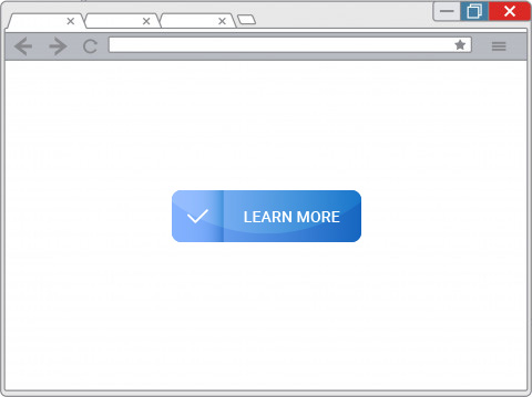
Buttons
No matter the type of opt-in service you provide, be it a click-through, hyperlinked or input bar, buttons can take full advantage of white space.
Many marketing solution companies add their buttons separately from the rest of their content, making sure it stands out and is easy to find and use.
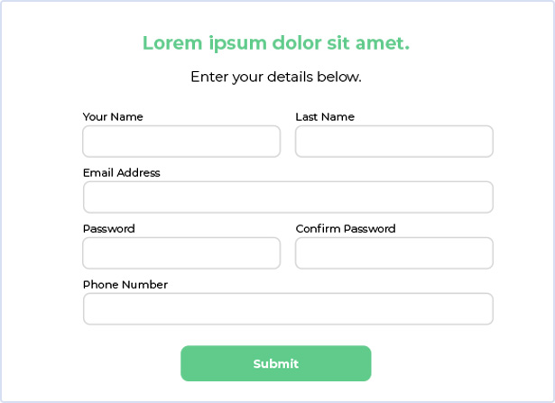
Lead capture form
Lead capture forms are understandably one of the most critical landing page elements for any company, so it only makes sense to highlight them with plenty of white space to draw as much attention as possible.
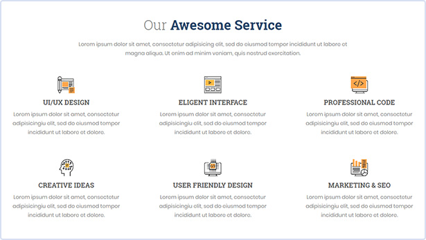
Company services
For most, rather than trying to read an entire page, web users would rather scan a web page quickly and easily to find the most valuable information. That’s why designing your landing page with a healthy amount of white space has been proven to be ideal.
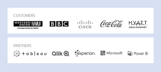
Company badges
Like customer testimonials, professional company badges are among some of the most convincing aspects of a landing page. So, it’s no surprise that it will look even more impressive if displayed boldly and front and center.
Inevitably when you add white space to any landing page design, the page will likely get longer. This isn’t necessarily a bad thing because web users expect to scroll. As long as you make sure to include other visual cues on the page to point visitors in your desired direction, visitors are likely to stay focused and engaged.
How Whitespace Brings the Difference in Graphic Design
When designers talk about white space, they actually mean negative space, the space between elements in a composition. So, what does that mean in layman’s terms?
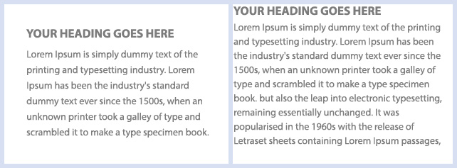
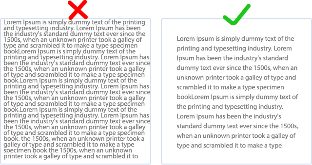
- Makes reading easier – Books and magazines are a great example of the importance of white space. The margin – the blank area between the text and the edge of the page – makes reading dense work much easier.
- Creates balance and symmetry – Balance is one of the fundamental principles of design. It refers to the way elements are distributed throughout a layout, and it provides a sense of order and stability.
- Establishes contrast, emphasis, and hierarchy – Just as we were taught to read from left to right, it is important to show the same kind of guidance on a website or in an article. White space can emphasize certain aspects while downplaying others, by depicting the hierarchy of a subject your viewers will always know where to look first.
In essence, white space in design creates focus, balance and reinforces quality and professionalism. It is visually appealing and creates a clean, relaxing visual effect. Put simply without space; you don’t have a design.
We all want to make an impact, that is the very reason why so much thought goes into each style and concept we create. However, in some cases some errors can crop in that are known to turn any prospective audience off.
These include:
- Using words instead of visuals – It is a common mistake to include too much text when a piece is meant to be primarily visual. This is especially true in infographic designs. Rather try to avoid this error by following the moto a picture is worth a thousand words.
- Lack of negative space – One of the single most important design decisions you will make in the creation of your project is the choice of color combinations. Many times, a project with good potential can fail if the right colors are not chosen.
- Mismatching fonts – Another common mistake is to attempt to fit too many words into one line of text. To avoid this try reducing the length of your sentences.
- Inadequate space between lines – Having too much space between lines can cause your text to appear disjointed, while having too little space can make the blocks appear too tight and crowded, to avoid this issue try planning each step in your design before you begin.
- Ignoring visual hierarchy rules – An important principle of graphic design is a visual hierarchy. It tells the viewer the importance of each element about the rest; if this is ignored, it can cause problems with how your content is perceived. To avoid this, make sure of your content priority beforehand.
Using White Space Productively in Design
It is often said, “It’s not what you do but how you do it that counts,” and it is no different in design. So, when starting, the first question one should be asking is how exactly white space can be used to better a design concept, no matter the content.
- Gauging your space specifications – White space is actually broken up into two types, namely micro (small, minimum space) and macro (large, maximum space) you will need to decide which one would best benefit you in the earlier stages of your project.
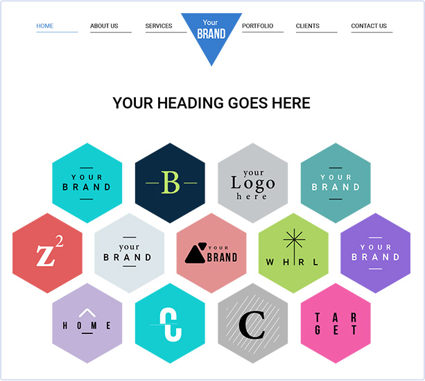
- Whitespace in logos – As stated before, a logo should always be at the top of your hierarchy, it should be where your audience looks first. A fantastic way of achieving this is by surrounding your logo with macro white space, the letters or images will practically jump out giving an attention-grabbing effect.
Making White Space Work For You
White spacing can be a powerful design tool and can highlight the integrity of your layout. However, it can be hard to master. Because of this, you need to make sure you choose the correct partner when designing with white space or you could run into problems with Outsourcing Graphic Design.
At Artwork Abode, we take designing very seriously, our team of creative experts combines high-end technology with innovation to create outstanding designs and illustrations that can help your branding efforts make a distinct mark for your products and services.
Some of the services we provide include:
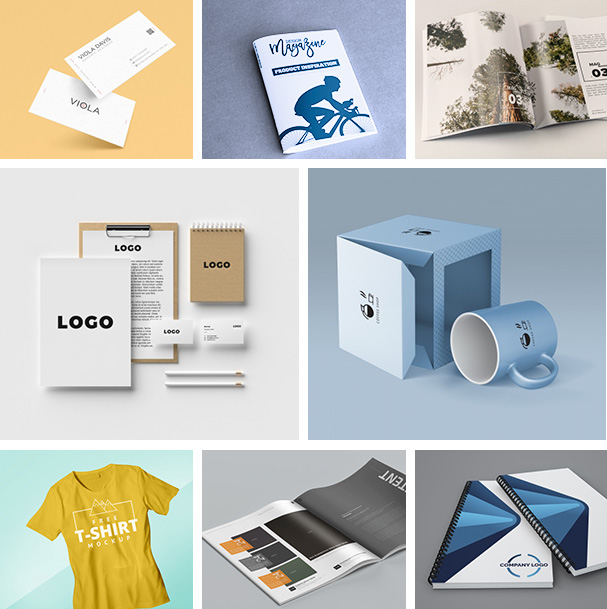
- Print Design
- Logo Design
- Infographics
- Motion Graphics
- Promotional Design
- Digital Illustration
With unmatched quality, we are your one-stop solution for all kinds of design requirements, so if you need to design that next big project, don’t hesitate to reach out to us and let’s get you started!
– Artwork Abode
Artwork Abode