It seems every new decade brings a newer form of communication that trumps the current standard. In the 1950s televisions became affordable and more and more families purchased one. Soon, TV replaced radio as the main form of entertainment and news for most Americans. The next big leap was the Internet. The abundance of instant news and information available today is being blamed on the downfall of circulation for newspapers. Some major dailies are reducing the days they print from seven to four or five.
One print medium that is holding its own against the Internet is magazines. Still, the editor and designer need to provide quality content and produce a magazine layout that invites readers in to keep from losing readers who drop subscriptions.

Set Up
Establish the printed page size and number of pages for the magazine and open a new document in a desktop publishing program like Adobe InDesign. Set the file up using these criteria. The number of pages must be divisible by 4—that is how a printing press is set up to produce the final version.
Select grids from the document set up page to display lines across the page. These will not print; they are used to help the designer place elements in the magazine layout.
Images
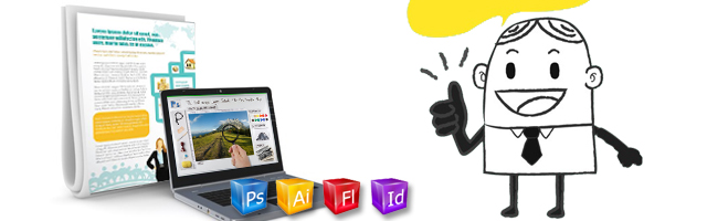
Illustrating the product can be done with a variety of images: photographs, clip art, infographics or typography. We’ll talk about the ins and outs of using each one.
Photos
Use a main photo in a magazine design that is simple, dramatic and well composed. When using the photo to cover an entire page, find one that can be cropped as a vertical. If using it for a two page spread, make sure the crop doesn’t’ cut off any vital information and bleed either option to the edges of the page.
The photo should contain empty space so the text elements can be placed over it—headlines, sub-headlines, bylines, text, captions, and any other information needed for the magazine layout. If the picture is too busy, or contains dark colors, the amount of text placed over it is limited. Using light text on a dark background is dramatic, but can be hard to read so use small blocks of text in this design.
Clip Art
The go-to graphic for illustration purposes can still be used, but look for well- drawn, detailed, professional looking images. Avoid the overused clip art images that come with Microsoft Office. These images were designed for use in PowerPoint presentations and were meant to make a quick point. When used in a high quality magazine layout, they will stick out like a sore thumb and make the entire publication appear cheap.
Info-graphics

The idea of using graphics and words to illustrate a point allows the reader to gleam complex data at a glance. Don’t just rely on using bar or pie charts easily created by any illustration program. Think outside the box and make the most of the information available. An article on the use of creating data visualization that appeared in Smashing Magazine, “The Do’s And Don’ts Of Infographic Design” illustrates in examples and step by step guides how to produce stunning information graphics for your magazine layout.
Type
The fall back tactic to try when little to no images are available to illustrate an article, the use of type as a graphic is an excellent way to not only spruce up the page but invite a reader to jump in and savor the content. Initial caps and decorative fonts can create a certain mood are can make an image when none exists. As with any illustration, be careful to pick a readable typeface. Many decorative fonts are available but are meant for very specific purposes. Make sure you select the right one or the design will likely fail.
Placement
The magazine layout of each page must also be compared with the other pages in the publication. Be careful of poorly chosen juxtapositions with other articles. Jay Leno and David Letterman have made life-long segments out of showing embarrassing newspaper layouts where an image is placed next to a headline and the two are not related, but the layout makes it appear one illustrates the other. This is not only embarrassing to the designer but also potentially libelous.
The future is already here and more and more publications are being read exclusively on mobile devices. Keep up with current trends and adapt to take advantage new communication methods.
– ArtworkAbode
Artwork Abode