Colors affect people’s moods in a lot of different ways. This is a concept that can be traced all the way back to the initial days of marketing and continues to be one of the primary concepts used in branding today. Most people don’t even realize how powerful a role color has on their purchase decisions. A buyer’s mood is the biggest factor in whether they will make a purchase or not, and this is the reason color theory has such a significant role in brand identity design.
Look at how UPS built their entire marketing campaign around the color brown. Even their slogan is, “What can brown do for you.” This simple concept of an otherwise seemingly plain color expresses everything that UPS stands for and promotes the right mood. This will be discussed in more detail later in the post. For now, it’s important to understand that color philosophy must be one of the defining factors in a branding strategy.
What Is Color Psychology?
Color Psychology is defined as the study of colors and their direct impact on human behavior. Each color plays a role in how people feel and the way they act. Black usually stands for life or death; the color red screams “alert,” and purple makes people think of health.
Why Is Color Psychology So Important for Branding?
Aside from the literal definition, entrepreneurs need to be aware of the legitimate impact that colors will have on their brand.
- Colors used in branding convey a very specific message, all without saying a single word.
- Target markets are more likely to respond to a color that provides emotional appeal toward the solution of their problem.
- Colors make brands consistent in their messages. Therefore, brand messages stand out.
Never underestimate colors because studies have shown time and time again that they have a powerful impact on branding.
Color Theory and How It Impacts the Brand Image
It’s time to look at the powerful impact that colors have on delivering a brand’s message. Brand color philosophy uses a framework of creativity that uses colors to promote the emotions that people experience when using the product or service. Each color has its own role to play.
- The Concept of Black Black is one of the most popular colors in retail because it represents professionalism and sophistication. Most of the text should be written in black since it’s the easiest to read. Only specific words or phrases should use another color, and only when that word needs to convey an emotion. Even then, it should be limited.
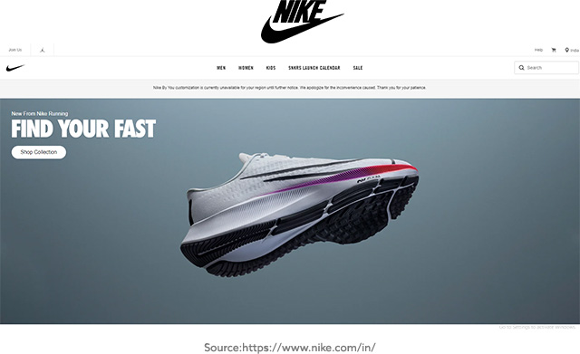
Nike uses a black, white, and grey theme on its website to promote a more minimalist view. But they design all buttons that need to stand out in all black, thus adding professional emphasis to them.
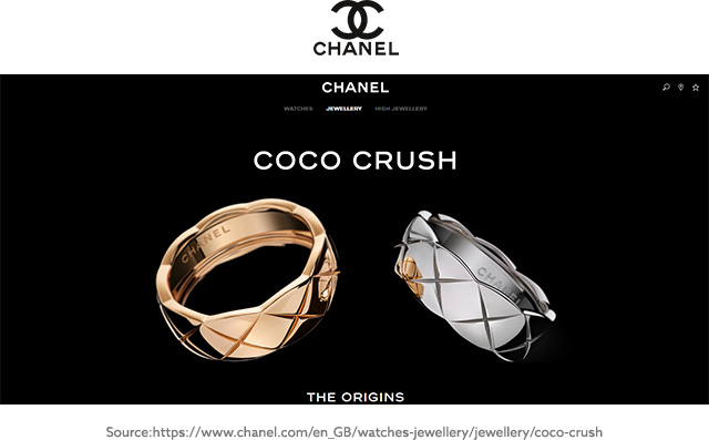
Chanel’s logo is black, and its website is black text on a white background, thus creating a professional look that makes navigation a breeze. Black is the primary color of professionalism.
- White is the Cleanest Color White represents humility and cleanliness in most cultures around the world, which is why it’s used as the backdrop on most eCommerce websites. It’s also the cleanest looking color in the spectrum, so using it as a background in product photos is also a good idea. Top brands in the world are starting to embrace white.
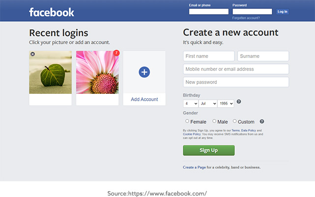
Facebook drops its white letters onto a blue background, thus bending a few of the color rules to have attention drawn to it. But it gives the name itself a nice, professional, and clean look while also ensuring that it’s unique enough to draw attention.
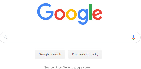
Google, the most popular search engine in the world, uses a primarily white minimalist design. This is mostly done to simplify information being presented in its searches, thus making it easier for users. White makes all of the information much easier to read while not distracting its users.
- Grey Psychology Grey represents balance in psychology since it’s where white and black meet – sort of the intersection of ying and yang. Grey also expresses sadness, but it really just depends on its application. In most cases, this is a color that’s used in fonts that need to be balanced and neutral. However, some brands take it a step further.
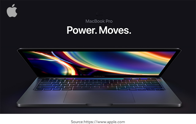
The most famous use of grey in branding is with Apple. Their laptops are usually designed with a grey tone to represent neutrality. Their marketing uses a mixture of white, black, and grey to maintain a sort of minimalist, balanced look.
- Blue Promotes Security More specifically, blue reminds people of the sky and sea, two things that everyone depends on for life. Therefore, there is a sense of trust that comes with it. It’s why security brands and certifications are prominently blue in their design. However, brands need to be very careful because blue is also linked to sadness. Therefore, a brand designed around happiness might want to avoid blue.
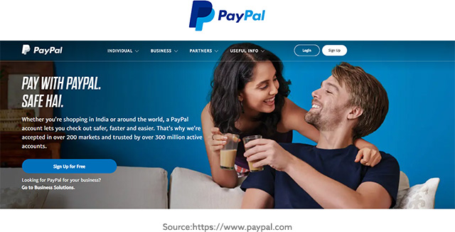
There are so many brands that use blue in their message that it’s hard to pick. A good one to start with would be PayPal. When considering that they want people to feel safe enough to trust them with money, then it makes sense that they would base their brand primarily around the security of blue.
Walmart is a retail brand that uses blue to help build itself on a foundation of trust. It’s also based on a lot of guarantees, so the reliability of blue also makes sense.
- Red Grabs Attention The red color screams for attention and is full of energy, but mostly promotes a sense of alert or danger. Red tells the brain that it must take action. If you look at a majority of websites, red is prominently displayed on buttons where the designer wants people to take a specific action – buy now buttons or subscribe buttons. With that said, red must be used carefully, or it can quite literally scare away customers. It only works if contrasting with other elements of a marketing message.
One of the biggest brands to use the color red is YouTube, but they don’t use it as a form of an alert. They use it to promote the excitement of watching videos online. Back when YouTube first decided on its brand message, watching videos online wasn’t as niche as it is today, so there was a lot of excitement surrounding this type of niche.
- Reign in the Sunshine with Yellow Yellow is quite obvious and resembles the sun. When people think of the sun, they think of happiness, optimism, and positivity. If you notice, yellow is generally used when a brand is expressing something positive. For instance, Walmart uses it for its “rollback” sales, and charities use it to display the “happiness” that donations bring. Bringing in yellow to display these types of messages on a website can do wonders for a business.
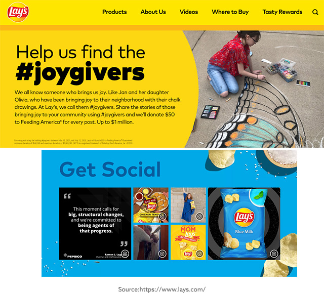
Lays is a popular brand that uses yellow in their message to promote happiness. They want people to feel like eating their chips will directly lead to happiness because they are so delicious.
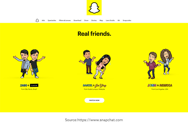
A newer brand that uses yellow is Snapchat, expressing the fun and happiness of using their app. All of their picture filters and the design of this app is designed around the concept of happiness, so it makes sense that their logo is yellow.
- Psychology Behind the Green Color Green is the most common color in association with growth, and it also connects emotions with nature. So, investing firms and environmentally friendly brands generally use green as a primary color for marketing. With that said, wealth doesn’t have to be monetary either. It can be the growth in knowledge, health, or anything else. So, it works with fitness and coaching brands as well.

John Deere has built the entire foundation of its brand on the color green, so this one has to be listed here. They don’t just reserve this color for their branding, and every tractor is built green, thus allowing their brand to be clearly seen in everything they do. People can instantly spot a John Deere tractor without even needing to see a logo.
- Orange Promotes Creativity Orange is a more adventurous color and has always been associated with creativity and enthusiasm. While it’s brighter than red, orange doesn’t come with the same sense of danger or alert, so it can be used in more calming, yet enthusiastic marketing messages. It can, however, still be used to draw attention to specific elements.
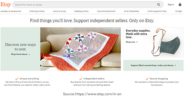
Since orange represents creativity, it’s no surprise that ETSY uses it as a basis for their brand. Everything from their logo to web design uses orange to promote a message of creativity.
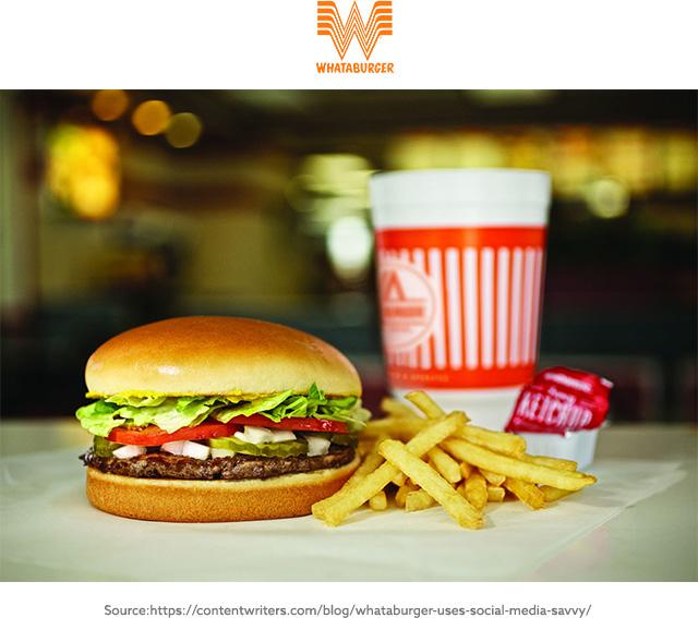
Whataburger is another brand that uses orange heavily. This usage is designed to express enthusiasm about having their delicious food and their adventurous desire to be different from other fast-food chains.
- Pink Conveys Playfulness and Love Playfulness and love are two of the primary emotions that people attach to pink. It’s also associated with femininity, but that fact circles back to the primary two moods. For instance, lingerie brands tend to use pink as their primary color because their products involve both love and playfulness.

The most popular association with pink comes from Breast Cancer Awareness. While cancer is certainly no love or playfulness, it’s used as a way to draw attention to an important issue. The message is that this cancer kills people that are loved, so show compassion by being aware of this disease.
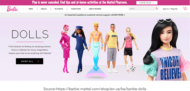
Barbie also uses pink because Barbie dolls are feminine toys, so the playful message works.
- Purple: The Life of Luxury Purple has always represented a life of luxury. Even Kings and Queens used to use this color to represent royalty. The only problem with purple is that it can also be seen as arrogant, but this comes with overuse. Just be sure that it’s used strategically.
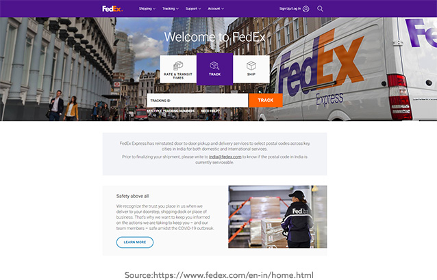
FedEx is a great example of purple branding. Whereas its competitor UPS uses brown to establish its foundation, FedEx uses purple to tell the world that it’s the top choice. Purple adds a feeling of luxury to using their services.
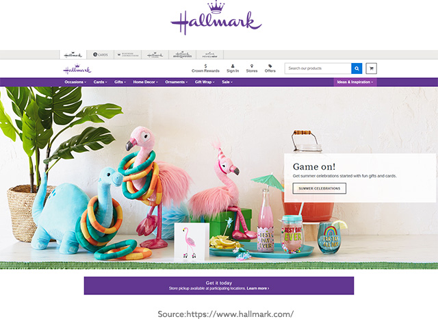
Hallmark is another brand that primarily uses purple in their branding. Again, it’s to promote a sense of royalty, which is matched by an actual crown in their logo.
- Brown is Reassuring The color brown provides a sense of comfort and reassurance due to its earthly nature. After all, what better reassurance is there than the ground that’s walked on? Everyone trusts it. Brands that want to promote reassurance in their message will choose brown.
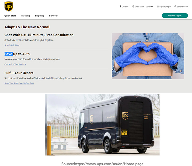
As mentioned earlier in the post, the most popular usage of brown comes with the behemoth postal company UPS. Their slogan even uses color to emphasize their reliability. This same company backs up their orange with yellows, promoting happiness.
Start Paying Closer Attention to Color
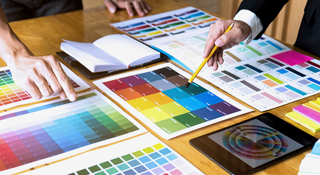
Individuals are encouraged to look for these colors every time they go shopping just to see how strategic stores are in their placement of products. One of the things that instantly jumps out are brands and how they are placed within the network of competing brands. It’s not by accident. Shelf and color placement is thought out and planned by teams of creative minds.
Let Design Experts Bring Your Brand to Life with Breathtaking Designs
Artwork Abode (AWA) has built a team of experts from different cultures, thus combining years of experience with a diverse team. This leads to even higher levels of creativity that brands from around the world can tap into! Our creative team understands the impact that color theory has on branding. It plays a huge role in brand identity design and reflects in our illustrations services as well. Let these expert teams help you breathe new life into your brand with Artwork Abode’s range of services, including illustration, desktop publishing, and brand identity design that revolves around color theory.
-Artwork Abode
Disclaimer: All the product names, logos, trademarks, and brand names are the property of their respective owners. All the products, services, and organization names mentioned in this page are for identification purpose only and do not imply endorsement.
Artwork Abode