Branding for the Olympic Games and designing the emblem every two years is serious business. It takes a team of people to organize the selection of these Olympic pictograms, as well as put the chosen emblem and mascot to use. The emblem and mascots are symbolic of the hosting country—as well as a status symbol for not only those who design it but the citizens of the hosting country. They’re used in combination with the Olympic Rings—the internationally renowned symbol for the games.
The process is begun years in advance, with organizing teams connected to the International Olympic Committee (IOC) forming a decade or more before the event itself. Once a host city is officially selected, the hunt for designs begins.
Olympic Pictogram Design Process
Upon the selection of an official host city/country, designers from the region begin to submit their concepts to be considered as the official Olympic emblem. One is chosen, generally out of thousands of submissions.
The International Olympic Committee has the responsibility of approving all Olympic emblems, which are then used in promotional materials, by sponsors of the Olympic games, and used on every uniform of the Olympic competitors.
Mascots are chosen in much the same format. Designers submit their work, which goes through an evaluation process. The Mascot Selection Panel will pick the ultimate selection of three and then voted on by local area elementary schoolchildren to pick the winning mascot.
History and Use of Olympic Design Elements
The main design elements that filter through all of the Olympic brandings include the Olympic Rings, the Host City Emblem, and Mascot.
Olympic Rings: Originally designed in 1912 by Baron Pierre de Coubertin, co-founder of the modern Olympic Games. They were meant to represent the five participating continents: Africa, Asia, America, Australia, and Europe. The colors of the rings, together with the white of the background were meant to include every competing nation’s flag at the time.
Emblems: Host City emblems used in conjunction with the Olympic Rings have been created since the early twentieth century. The oldest we were able to trace dates back to the 1920’s. Each one is an extension of the Host City—typically offering a piece of the spirit of its people, as well as the essence of unity amongst all those attending the games.
Mascots: Since the 1968 Winter Olympic Games in Grenoble, France, the Olympic Games have had a mascot—usually an animal native to the area. After taking some time to get mascots off the ground, the first major mascot in the Olympics was Misha (the name of the Russian bear mascot designed by children’s book illustrator Victor Chizhikov) in the 1980 summer games in Moscow. From that point on, mascots have continued to grow in popularity, especially with school-age children.
A Look at Recent Olympic Games Designs
Obviously, with a century or so of emblems and mascots, we can’t go over every Olympic selection, but we’d like to point out some of the interesting details of the three most recent—plus an honorable mention. Let’s take a look:
PyeongChang 2018 Olympics Designs
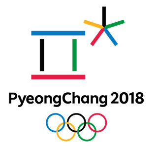
Emblem: South Korea’s emblem that’s paired with the Olympic rings for 2018 is a combination of the Korean characters spelling the ‘P’ sound (for Pyeong), and the ‘CH’ sound (for Chang). It was created using the five traditional Korean colors (as well as the colors from the five rings), by artist HA Jong-Joo.
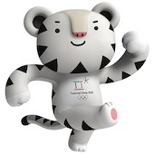
Mascot: Soohorang is the name of the white tiger mascot for the PyeongChang 2018 Olympic Winter Games. The white tiger has been considered Korea’s guardian animal for a long time, and the etymology of the name Soohorang is meant to be symbolic of not only the challenging spirit and passion of the Korean people but also as a trustworthy protector for all who enter the sacred space of the Olympic games.
Rio 2016 Olympics Designs
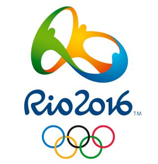
Emblem: Rio’s emblem was a three-dimensional approach, showing people joining hands. The colors of yellow, blue, and green were symbolic of Rio’s environment of sun, sea, and forests. The overall symbolism was meant to stand for the warmth and welcoming spirit of the people of Brazil as they celebrated the Olympic games with the rest of the world.
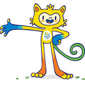
Mascot: Vinicius is the name of the 2016 mascot used for the Rio games. He was designed as a mixture of different animals, as well as being inspired by pop culture and video game/animation characters prevalent in Brazil.
Tokyo 2020 Olympics Designs
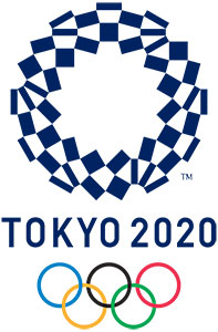
Emblem: The original design that was unveiled for the Tokyo 2020 games was scrapped over allegations of plagiarism by its designer. A special committee was created by the IOC Tokyo organizers to select a new design, which was unveiled in April 2016. The winning design is entitled Harmonized Checkered Emblem, which is obviously an ode to its appearance. But beyond that, it’s meant to represent all the different countries, cultures, and ways of thinking by those joining the games.
Mascot: A mascot for the 2020 games is still undergoing the voting process, but is expected to be unveiled at the end of February.
Honorable Mention: London 2012 Olympics Designs
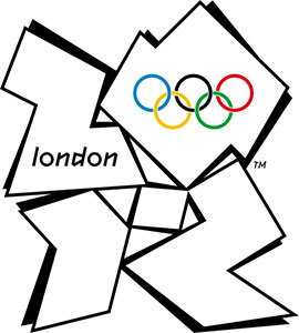
Emblem: The 2012 London Emblem is now an infamous logo—notorious now for being one of the more hideous of designs by the public, designers, and critics alike. However, the simple fact it was able to create such a visceral effect means the logo may have done its job perfectly. According to Wolff Olins London, the designing company for the logo, the concept was to design something completely organic—coming from an energy grid moving around but contained within its box. The term the designers used to identify the concept was, “prescribed anarchy.” The idea was to be slightly off-center, but still cool—a concept which the designers felt described London perfectly without being overtly historical, like most emblems. The colors used were bold variations of pink, blue, green, and orange—inspired by the worlds of media, communication, and fashion—and carefully chosen to communicate the spirit of London: energetic, spirited, bright, and youthful.

Mascot: London’s 2012 mascot was named Wenlock, deriving his name from the town of Much Wenlock in Shropshire. Interestingly, this small town still hosts the traditional Much Wenlock Games, which is something the co-founder of the Olympic Games’ resurrection, Barron Pierre de Coubertin, has touted as an inspiration for the modern Olympics.
Final Thoughts – Designing Olympic Pictograms
There’s a historical pressure when designing the perfect pictogram in the form of an emblem and mascot for the Olympic games. With years of preparation, selection, and criticism that comes from being such a public-facing brand, it’s no wonder some will stand out, while others will fade into the history books. Each has their personality and style—and each brings their take on its people at the time of hosting the most renowned games in the world.
Understanding design in all its glory is a passion for all of us at Artwork Abode. If you’d like to work with design thought leaders who maintain curiosity on the evolution of design, then look no further than Artwork Abode (AWA). AWA would love to chat with you about our love of the process, the history of design, and get a custom quote ready for your next design project.
– Artwork Abode
Artwork Abode


