The nice thing about graphic design and any creative job is there really are no hard and fast rules. Unlike disciplines like engineering or science, where math is king, magazine layout design is open to interpretation.
While rules as we know them are not needed in design, readership studies and graphic design focus groups show that readers have certain expectations. By being too far out of the box, the magazine designer may end up losing readership instead of attracting more subscribers. Following some advice and guidance will help you to avoid that pitfall.
Typesetting
Open any desktop publishing software and you are confronted with hundreds of fonts. More are available for free download and for a small fee. Don’t let the sheer volume of choices overcome common sense. Pick a few fonts to use in each magazine layout and assign style sheets to groups of text. For example, use one font for the headlines, one for the body text and one for the captions. Other elements, such as pulled quotes, can be the italicized version of the headline font.
Use typefaces that are easy to read for the body text. Studies have shown that serif fonts, those with letters that are not straight up and down, are easier to read. Examples are Times New Roman or Garamond. The letters flow into each other allowing the eye to jump to the next word.
Column Width
Reading long blocks of text can be tedious. Break up the copy by using a magazine layout technique incorporating two or three column designs. This helps to break up the content and make it easier to read. If you change the default settings in the layout program, be careful to not set the columns too far apart or too close together. The software sets defaults based on many elements that make it aesthetically pleasing to the eye.
Proofread
Nothing screams unprofessional like misspelled words. Use the software spell check but don’t rely solely on the computer to catch mistakes. Many words are pronounced the same but spelled differently. Adding the human element back into the design process will pay off in the end. The most glaring mistakes occur in the headlines so have someone proofread those before the publication goes to print.
Another avoidable mistake in magazine layout is text flow. With desktop publishing, the content is picked up and laid out, and the cursor is used to flow the text from one column to another. Read the entire story again before printing because words can get cut off or the columns get switched, making the article unintelligent.
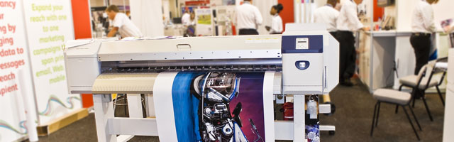
Images
Photographs should be cropped to achieve the best composition. Also, don’t hesitate to make color corrections or add filters for pleasing effects to a photograph. If you do alter the original image significantly, modern practice says to make a note of the changes in the caption.
Find Inspiration
If the magazine layout process seems to be getting stale, look at magazines that attract you. Pick them up and see how the designers used the same basic elements to create something different. Following this basic guidance and continually looking for ways to improve will be noticed, and appreciated by your readers.
– Artwork Abode
Artwork Abode